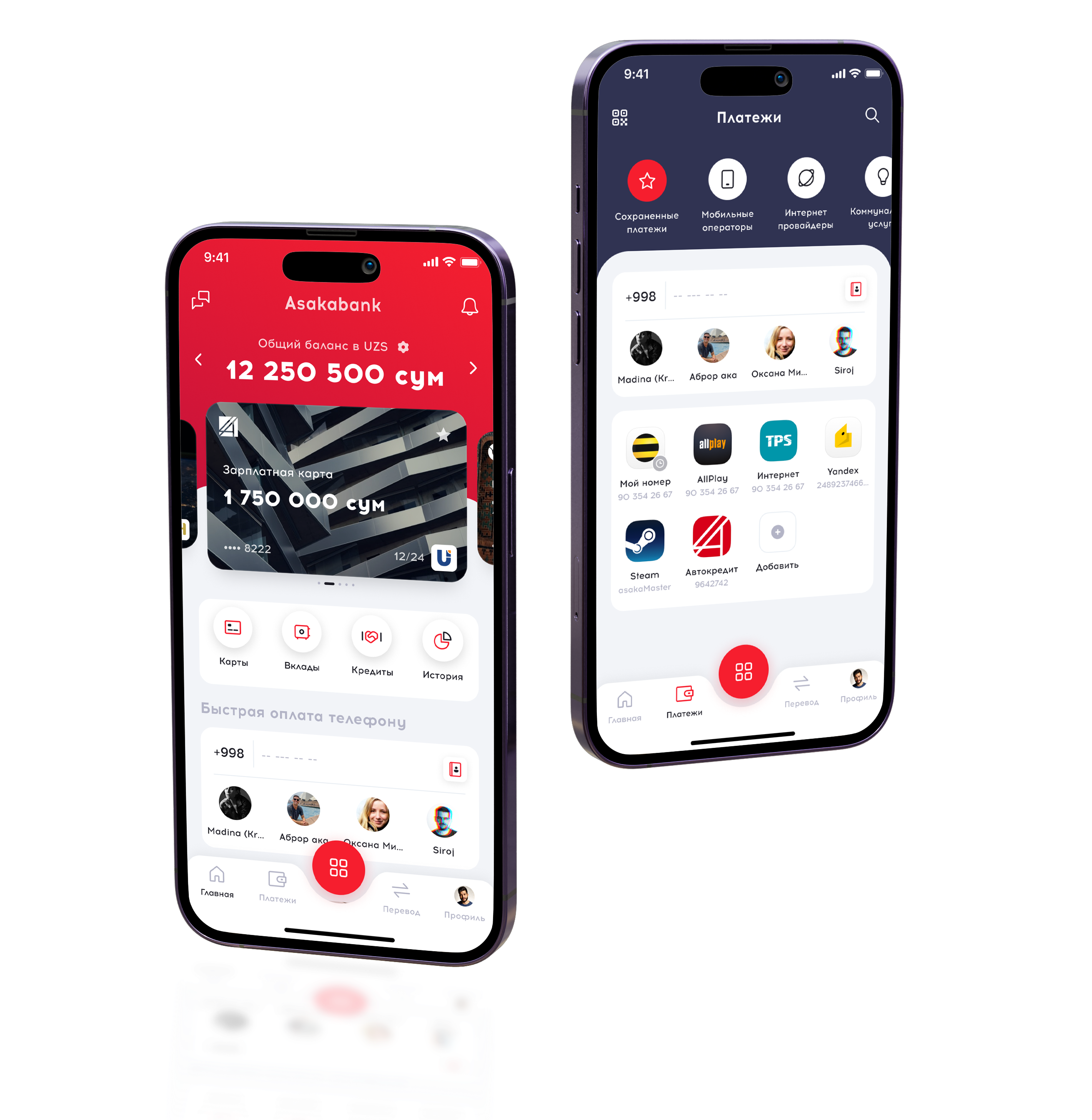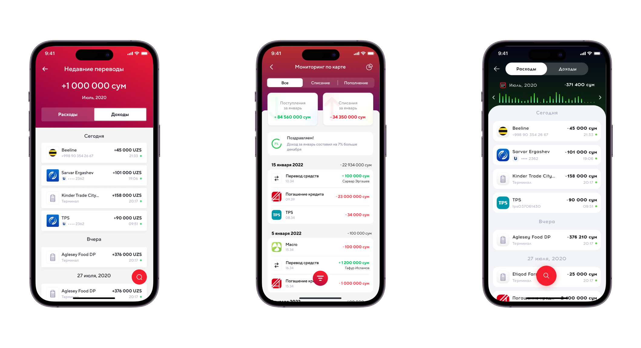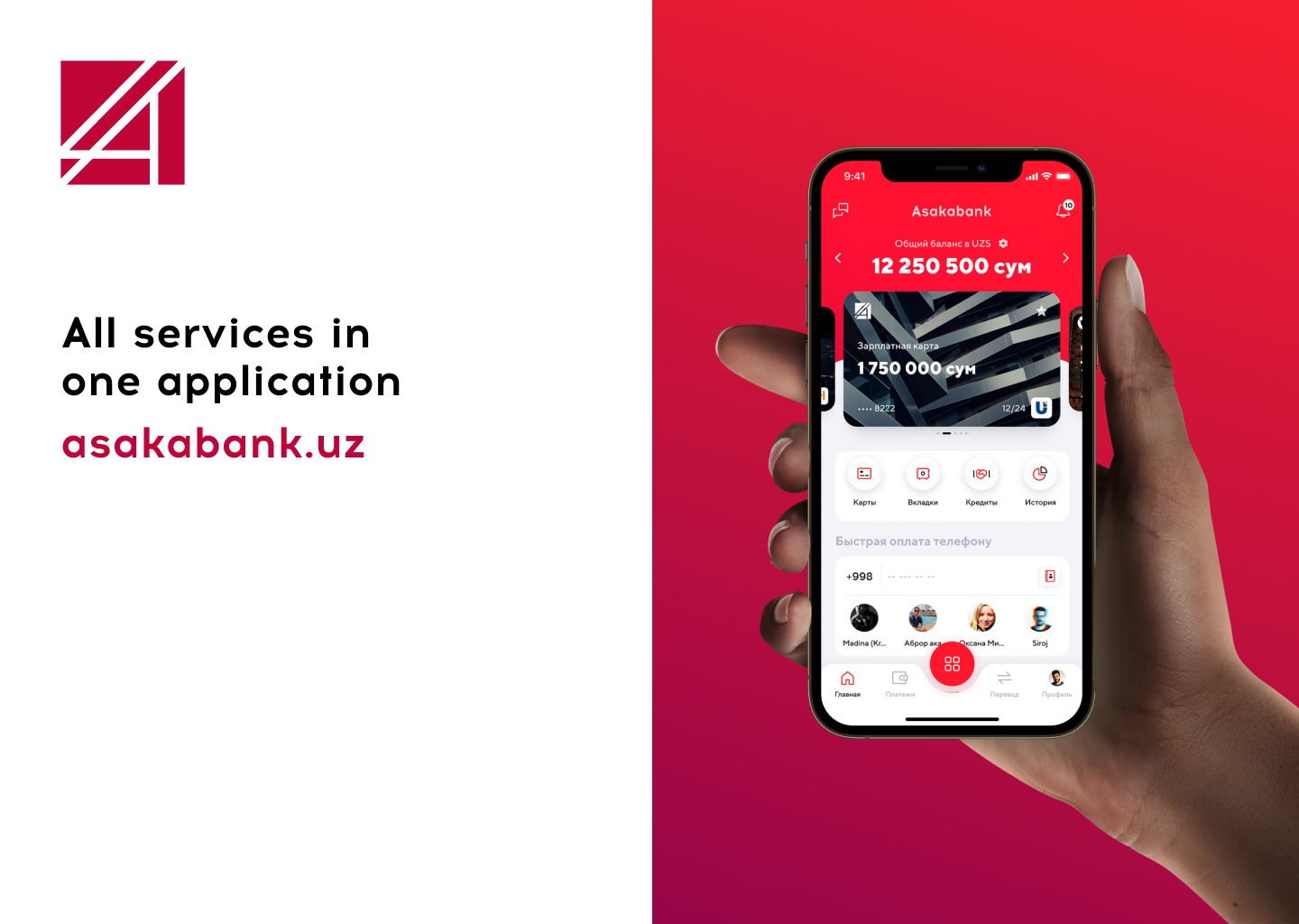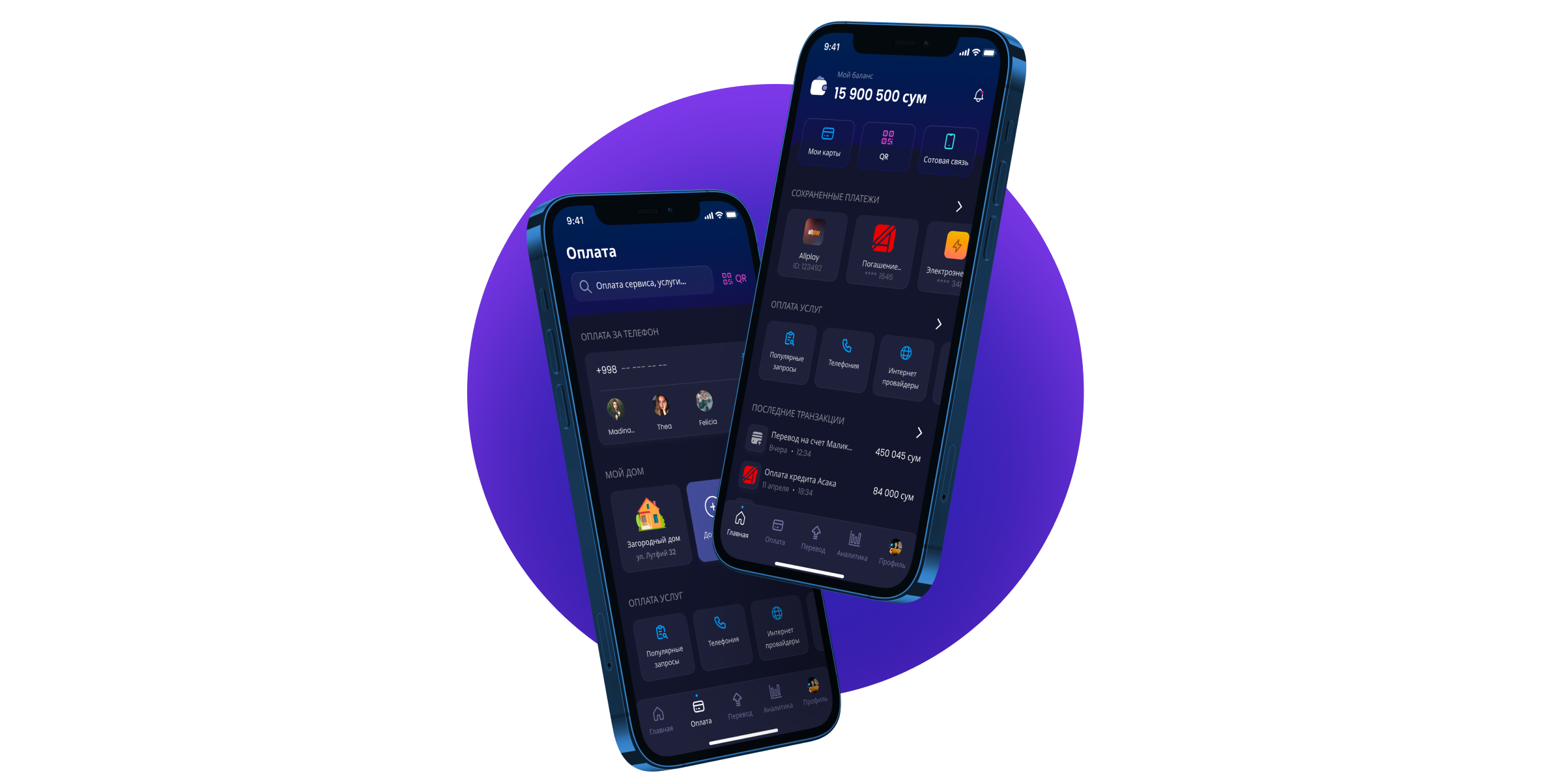
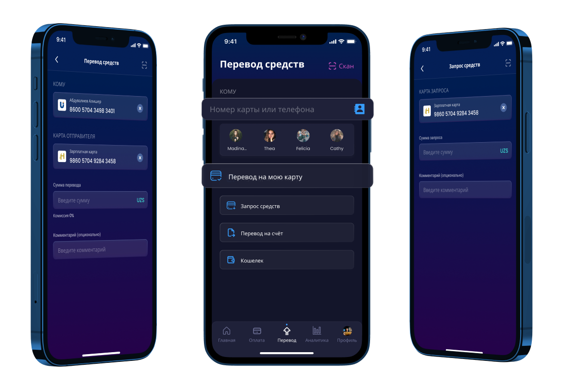
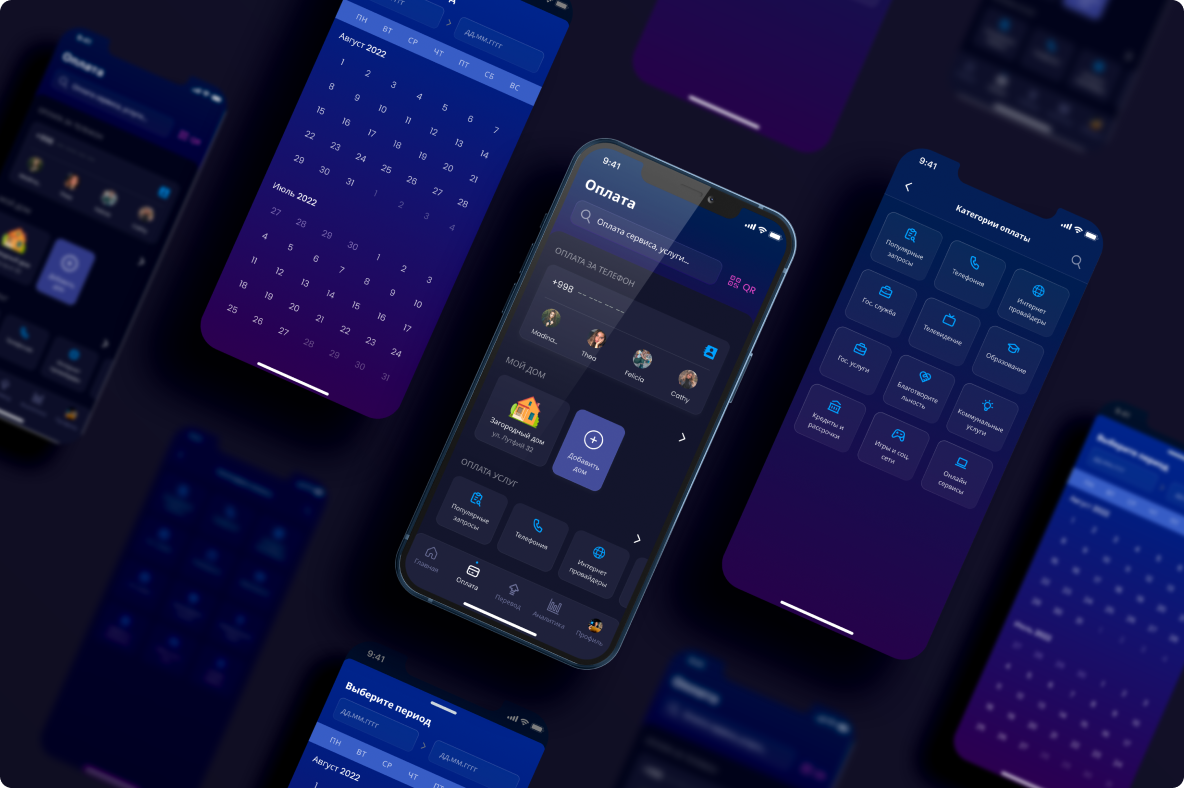
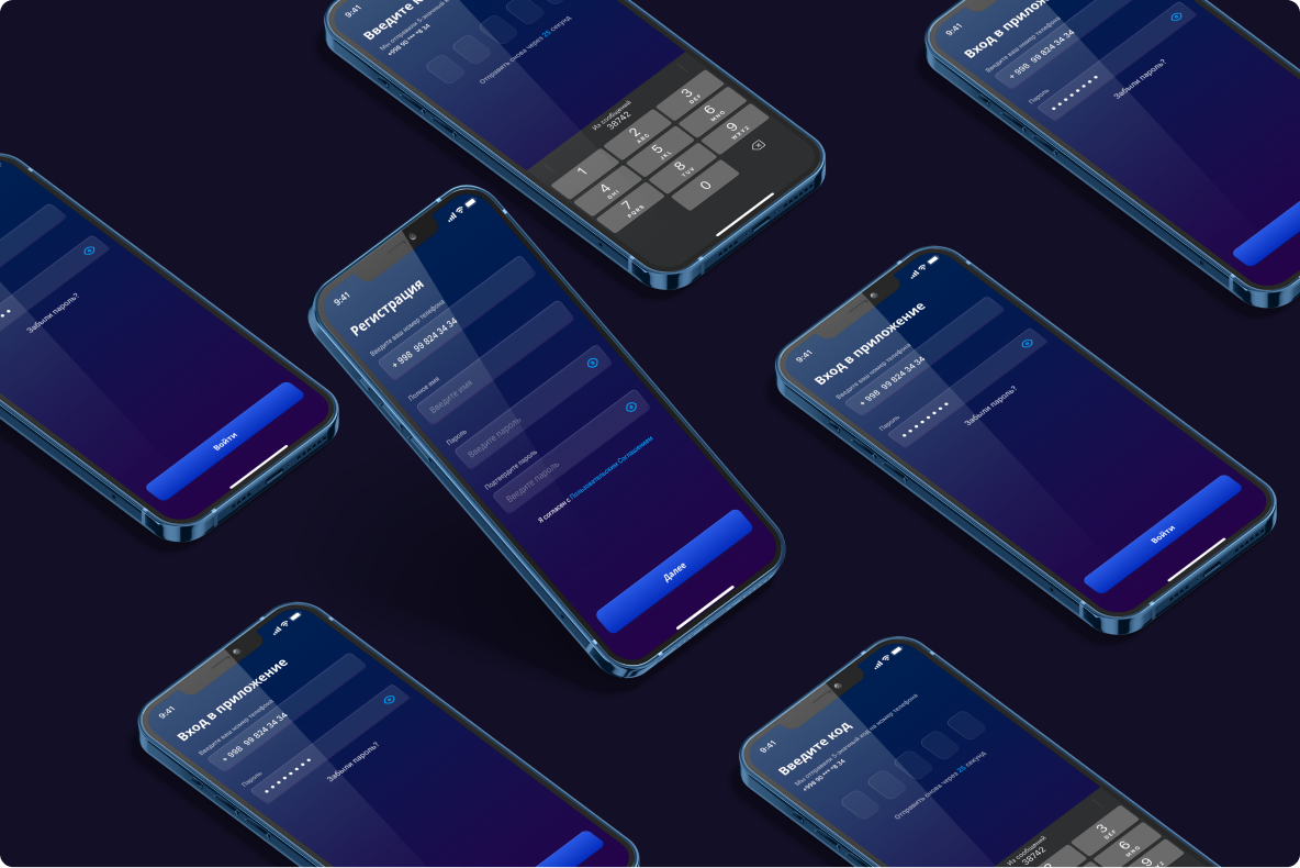
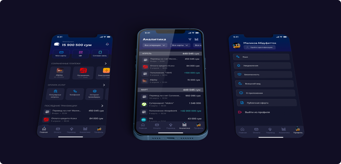
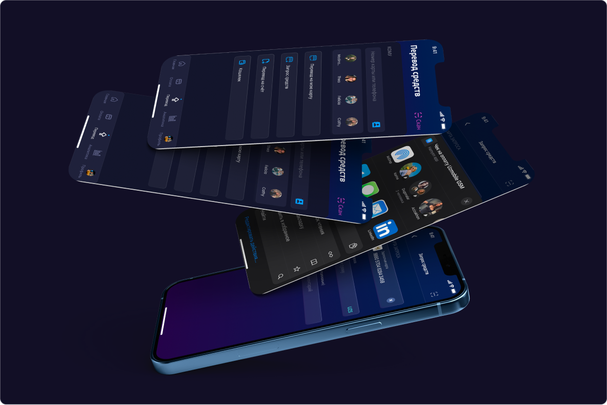
Hamyon is a powerful financial application designed to enhance the payment experience. The application is developped for Uzbekistan market and enable financial transactions between local and international services. The killing feature of the app is currency conversion and sophisticated monitoring
In the competitive fintech landscape, Hamyon aimed to stand out by creating a simple and innovative financial application with outstanding features. With a focus on transaction monitoring and incorporating advanced functionalities from leading fintech apps, Hamyon sought to redefine financial management
I've started in this project as an UI/UX designer and promoted to lead when the previour one left the project. It was very challenging and demanding project, but helped to promote my technical and communication skills.
I was responsible for the overall design of the product and successful team communication. Besides, I've done a lot of in UX testing: conducting usability and A/B testing, cognitive walkthrough and interviewing with users of competetive products. All results were been documented and shared with the team. As the metrics confirmed, all the reseach was very useful to create smooth and intuitive user journey
Even though, I really loved my teammates and had good relationships with the managers, the most difficult part in this project was leading the design team. It was the first time I worked as a design lead and I am very proud of our work.
Besides, there were some diffuculties to complete design of all the pages within MVP, sice we've spent a lot of time for the research. I could solve this problem by changing the management style from waterfall to agile scrum. Our PM had really helped with task delegation and setting deadline.
We’ve interviewed lots of users different age and position who use financial applications and identified common characteristics relevant to our target audience
Defining key moments clients struggle with while using our other fintech applications and fixing it in ours will definitely be our competitive advantage
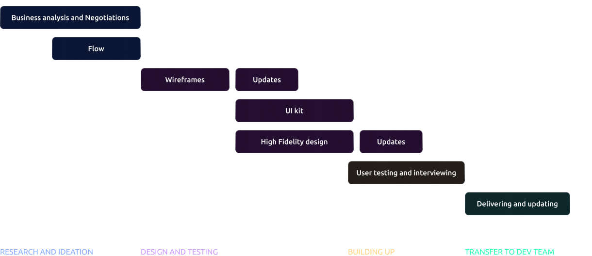
When me and my team team of designers received instructions, technical contraints and deadline, I've devided the whole process of interface development into several core milestones.
The heart of the whole design is it's UI kit (design system) and it took more than 1 month to complete. Company analytics really helped us during User testing and Interviewing, while developers
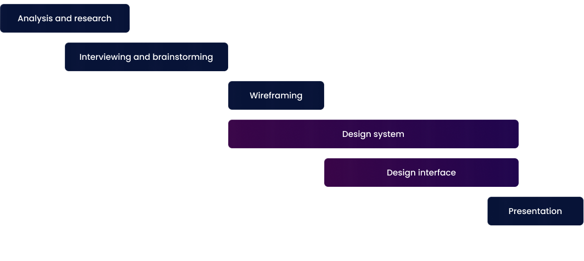
Taking into consideration all the technical and other constraints as well as requirements of the management, we've developed MVP after 4 months. The results of team of designer:
- Low fidelity design
- Sophisticated user and market research
- Design system
- User intuitive interface
- Logo and brandbook
- Prototypes
- Animations
- Sitemap for information
The design system we've developped help to keep the elements and experience recognizable through all the user journey. But the most essential is the value we could bring to lives of our clients with functions necessary for them, information and money security and safe, pleasant UX and fast transactions. Proudly can announce about successful completion of our objective.
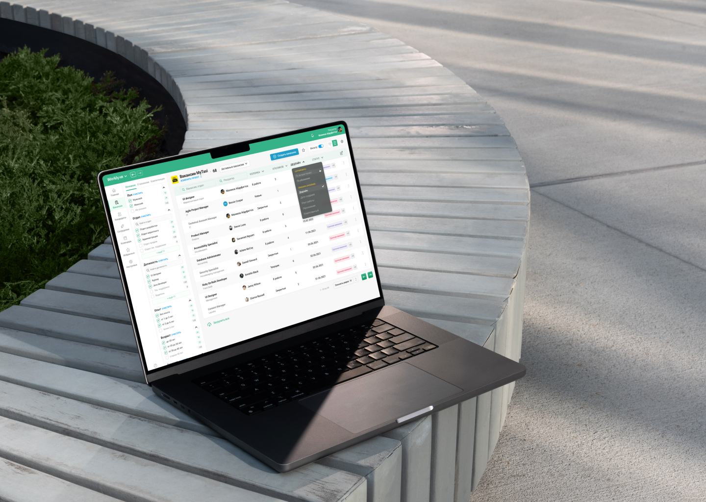
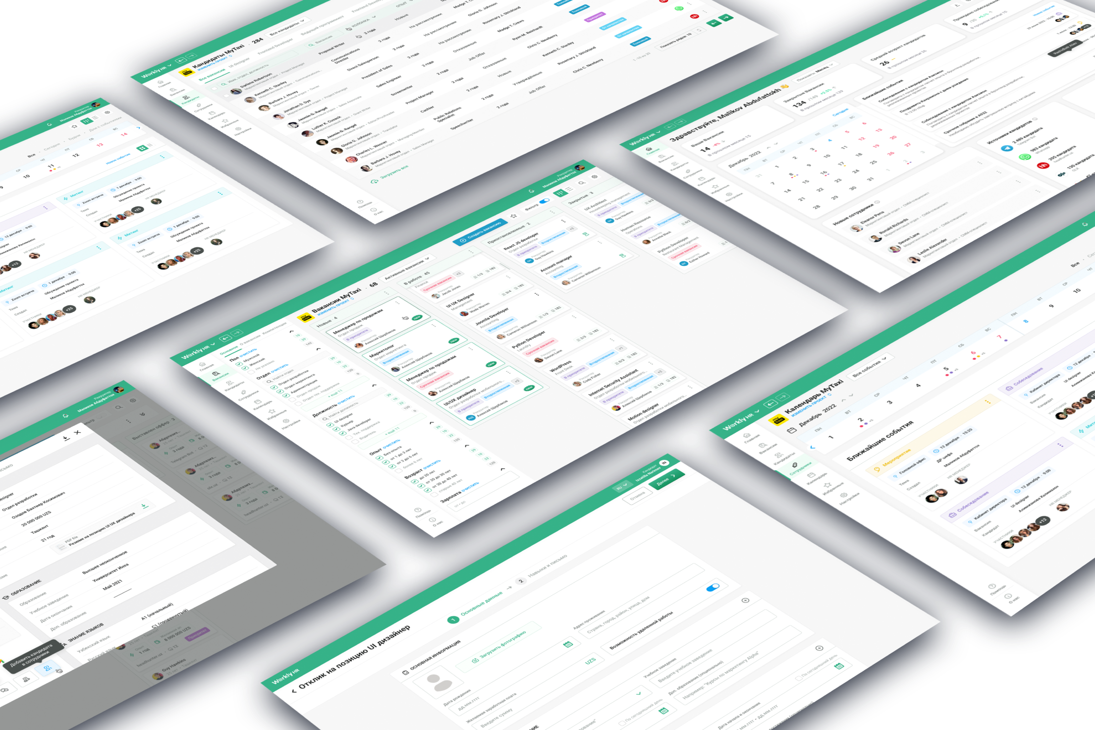
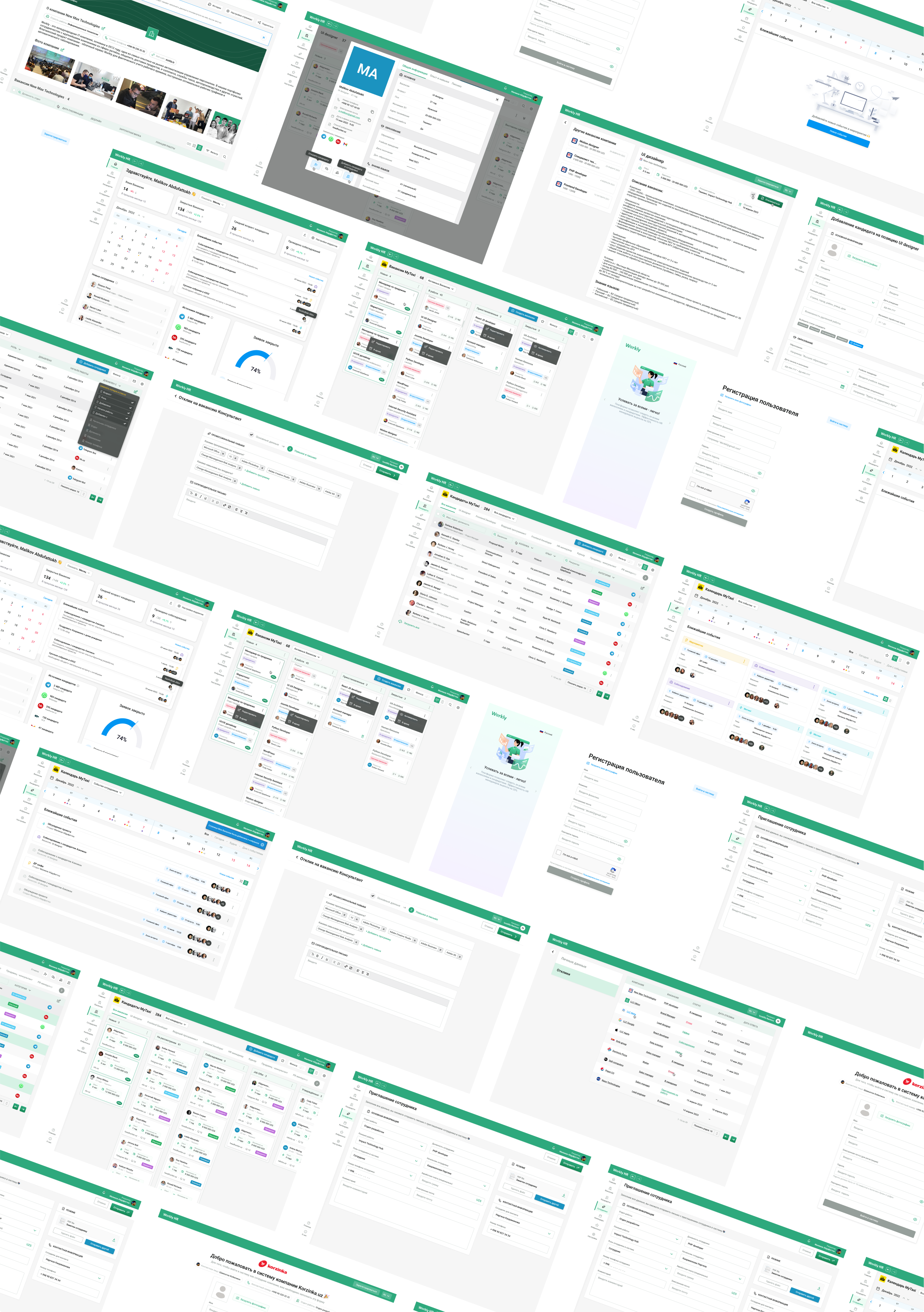
Workly is one of the leading local IT companies and provide services in automation human resources management by tracking attendance and performance of employees as well as payroll. The company has over 400 business clients, including Perfect consulting group, Global textile and Internation.
There was a request from many clients to develop a HR tech software to automate recruiting processes. So, there already was a high demand from real clients who would like to purchase a product. Moreover, some of these really helped us in user research processes, specifying the functions their HR department would like to use.
With our development team and managers I've formulated requirements for product and its design. In June 2022 we've started the design processes I will specify below.
In this project I was the only and lead designer and was responsible for all project visual part. Particularly, I worked on information architecture and flow, UI/UX design, product functionality and strategy.
Since the Workly HR is a part of Workly IT ecosystem, it has to have similar UX and the same design system. However, the main problem as well as objective in this project was to create user intuitive and authentically pleasing product for users who are not computer-savvy.
We had to present design after 5 months at the end of October 2022. On the MVP the product has to have:
- User authorization and registration to our system
- Company registration
- Main dashboards for simple statistics about recruitment
- Vacancies that recruiter can create and candidates can apply
- Employees page
- Candidates page where recruiter can schedule interview, send offer, accept or reject candidate
- Calendars page for scheduling meetings or interviews
- Settings page with customization options
The target audience is the businesses which continually hire new employees (both white and blue collars). The real system users are the recruiters and HR managers, people who are computer literate on basic level. Me with my data analyst collegue have conducted a survey, where 41 HR managers from different inductries have participated. And here are the results:
- 32% really use the tools to automate some work processes
- 60% think that HR tech tools have to integrated into their business
- Pain Points: The survey identified common pain points faced by HR professionals. The top challenges highlighted were manual paperwork and administrative tasks (42%), employee data management (28%), and time-consuming recruitment processes (18%).
- 62% want all systems they use in one software
Assuming all the information HR managers provided and making much deeper user preferences research, we've identified a representative user persona:

- The system has to allow both HR managers to publish vacancies and applicants to review and apply to the vacancy
- An internal user has to be able to create a vacancy, process it and eventually close it by finding appropriate candidates
- A candidate need to be able to create a CV using which he/she will apply to published vacancies
- Sophisticated dashboard with the statistics about the results of HR department
- Filter of vacancies, candidates and employees
- Possibility to work at different companies in one profile
- Calendar with upcoming interviews and meetings
- Possibility of custom personalization of the system UI
* this is only a small part of requirements from SOW set for product design team
-Develop a sophisticated and extendable design system that aligns with design code of other Workly Products
- Provide only data driven and/or proven in real cases solutions
- Divide the process of adding new features into releases and justify decisions about chosen variant of the feature
- All pages need to be prototyped and animated decisions properly explained
- Adjust some decisions after several constructive feedbacks from the customers
- Create several roles of the user, such as Owner, Administrator, Recruiter and Employee with their permissions
- Design a landing page highlighting the features of the system
- Design adaptive variant for candidate's pages
- Allow a user to create his own CV
The overall objective is to make user journeyhas to be smooth and clear throughout the product both for candidate and recruiter
After 11 months of focused work and tons of effort, we've introduced MVP of the system that is going through beta testing now. I beleive that all this work will be justified by the amount of value the product brings into clients' working process. The metrics will prove it eventually
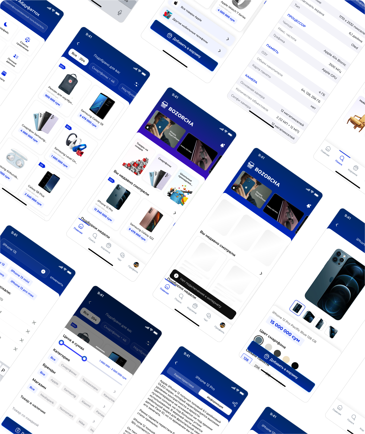
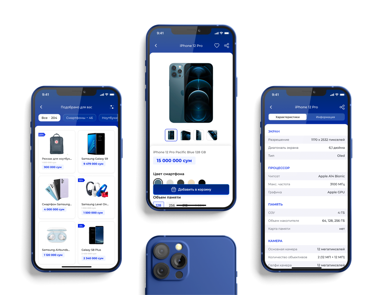
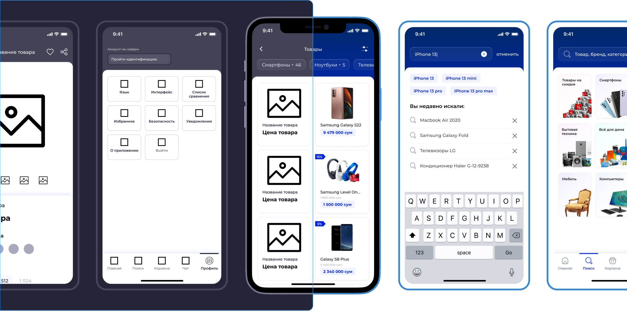
Even though there are several well developped marketplaces in Uzbekistan, none of them offers high quality products with loan option. Our team had identified that there is a free niche and developped a new application. We are planning to create an ecosystem around the marketplace, with web version and separate financial product for payment.
The main problem that the service solves is an ability to purchase gadjet or expensive product online, with online identification and with option of loan registration.
In this project I worked as a design lead and strategic advisor. My experience of development and successful launch of marketplaces really helped in terms of research and defining business model.
Our team had 2 senior and 1 middle level designer and each of them was responsible for some part of the product. Me, as a lead designer, was busy with design system and user research and analysis. Besides, I had been representing design team during meetings with managers, developpers and stakeholders
Since the product is new and innovative to the Uzbekistan market, we've dedicated a lot of time for user research and understanding user needs. The primary common task was to create authentically pleasing and easy to understand user journey for marketplace. The design has to be scalable to add new functions after completion of MVP.
Besides, we had a very wide target audience including different age groups, educational backgrounds, and technological expertise. Designing an intuitive and user-friendly interface that could cater to the needs of this diverse user base was a challenge that required careful consideration of user experience and usability principles
To identify user personas for Bozorcha, the marketplace mobile app targeting the Uzbekistan audience, we conducted extensive research and interviews. Here's an overview of our approach:
- Desk Research: We conducted desk research to gain insights into the marketplace landscape, cultural nuances, and online shopping trends specific to Uzbekistan.
- Target Audience Selection: We selected diverse cities and regions within Uzbekistan to capture a representative sample of the target audience, considering factors such as age, education, occupation, and income level.
- In-depth Interviews: We conducted in-depth interviews with the selected participants, focusing on their online shopping habits, preferences, challenges, and trust factors related to marketplace apps.
- Data Analysis: We analyzed the interview data, identifying patterns and themes that emerged. We looked for common pain points, motivations, and aspirations among the users.
- Persona Development: Based on the analysis, we created user personas that represented distinct user segments within Uzbekistan.
- Validation: We reviewed the personas with stakeholders, domain experts, and conducted user feedback sessions to ensure their accuracy and relevance to the Uzbekistan audience.
It’s a vital step in designing that enables to structure the flow, considering all development limitations and business requirements
Overall, designing process took 2 months and 3 weeks
The results of the work we've done:
- Documented user interviews and research
- Flow of user journey
- Wireframes (low fidelity design)
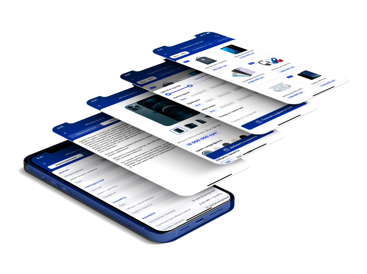
- Design system for both iOS and Android
- User interface for both iOS and Android
- Documented metrics and results
The results of design part that everyone can see and evaluate is an intuitive and easy-to-use interface, which is also localized and culturally relevant. The successful implementation of these solutions contributed to the overall growth and impact of Bozorcha. The app gained popularity among users, attracting more sellers and buyers to the platform. Increased transaction volume and user satisfaction led to improved revenue and market share for Bozorcha.
Me, as strategic advisor as well as a designer is proud about the work we've done and hope bright future of Bozorcha.